Branding
2025

CLIENT
Mozaic Spatial Magazine
TYPE · YEAR
Branding
·
2025
Mozaic is a spatial magazine covering architecture, interiors, cafés, shops and the places of everyday life. Its name and logo bring together different places and stories within one composition. The logo was developed as an individual project in 2025.
01 · Gathering everyday stories
A space holds more than form and material: it also holds the lives of the people who use it. Mozaic looks across buildings and neighbourhood shops, bringing places of different scales and characters into view. The name expresses how individual stories can retain their differences while connecting within a single magazine.
02 · From a field to fragments
Irregular mosaic pieces are the starting point of the logo. Fragments of different sizes and orientations share one field, expressing the variety of spaces and stories the magazine brings together. The gaps distinguish each piece while allowing the composition to remain a coherent whole.

01 / FIELD

02 / FRAGMENTS

03 / SPACE FOR A NAME
04 / MOZAIC
A single field divides into fragments, then opens a place for the name. The diagram unfolds the compositional logic of the completed logo.
03 · A magazine within everyday life
Mozaic shares the composition with the surrounding fragments. Rather than occupying a separate area, the name sits among pieces that meet the contours of its letters. The intention was to make the magazine feel embedded in everyday life, becoming part of the very scenes and spaces it explores.
04 · The completed logo
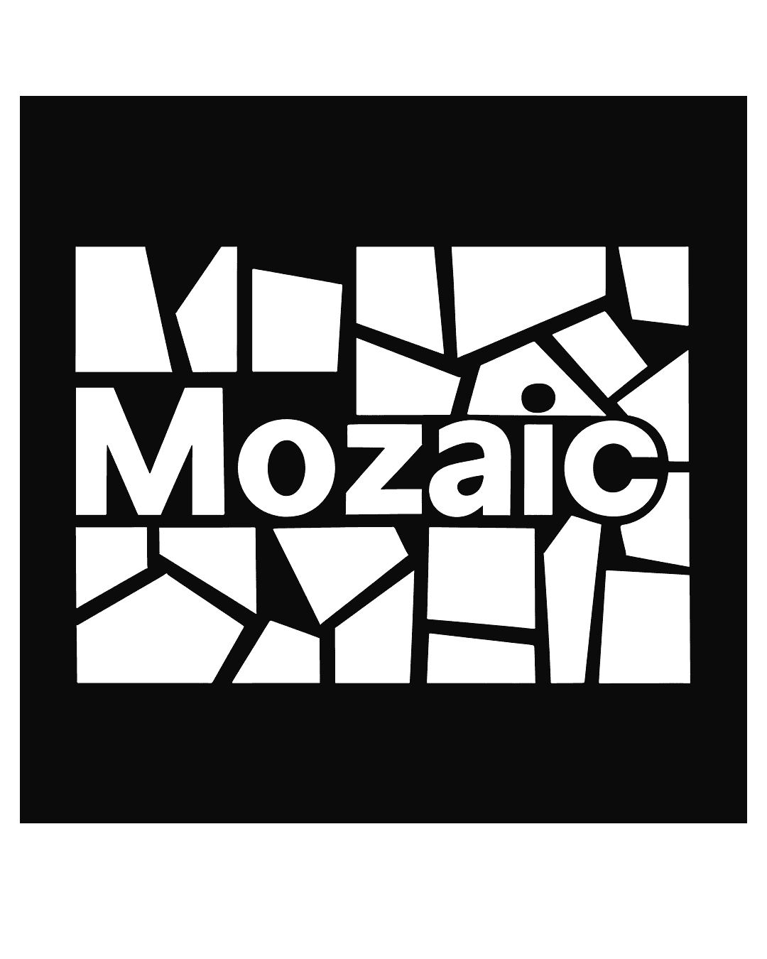
White fragments and lettering form a single composition against black. At close range, the differences between the pieces and their relationship to the letters become visible. Viewed as a whole, they gather around the name Mozaic. The project comprised logo design.
Project information
Year: 2025
Discipline: Branding
Client: Mozaic Spatial Magazine