Branding
2020

CLIENT
WAON Design Studio
TYPE · YEAR
Branding
·
2020
WAON is a design studio named after Waon Beach. Its identity begins with the idea of creating warm spaces where sunlight comes to rest. The sunset and the contours of the sandy shore are translated into the name, bringing landscape and lettering together in a logo and colour system developed in 2020.
01 · Where sunlight comes to rest
The warmth of Waon Beach is the starting point. A low sun and a gently moving shoreline convey the welcoming atmosphere the studio sought to create through space. Taking the name of a place also meant carrying its mood into the studio’s approach to design.
02 · From shoreline to lettering
The contour of the sandy shore becomes a flowing line, shaped into the rhythm of WAON. Landscape and lettering are not separate elements: the same contour suggests the coast and carries the name. Its rises, dips and connections retain a sense of movement within one continuous gesture.

01 / SHORELINE

02 / WAON

03 / SUN + O
04 / IDENTITY
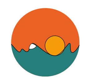
Shoreline → WAON → sun and O → circular identity. The diagram sets out the logic of the design development.
03 · The sun, the O and the circle
The small circle is both the setting sun and the O in WAON. It can be read as a sun resting against the shoreline or as a letter within the name. The overall circular form draws on the repeated ㅇ in the Korean name 와온 and the shape of the sun, connecting the name and its landscape through a shared geometry.
The small white opening recalls the foam left behind as a wave recedes. Within a composition reduced to lines and colour fields, this detail carries a trace of the beach.
04 · Colours drawn from nature
The palette originates in colours observed in nature. The selected combination brings together an orange sky, a yellow sun, a teal sea and white foam. Orange and yellow convey warmth, while teal grounds the lower part of the mark, allowing the contrasting fields to read as one landscape.
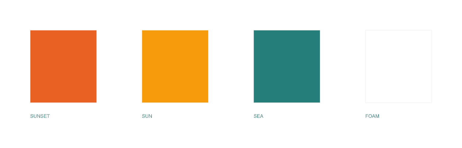
Sunset · sun · sea · foam. Colours from nature are expressed through broad fields and a small white opening.
05 · The completed identity
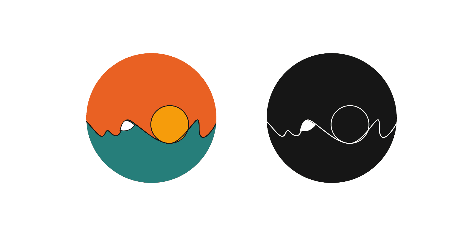
The completed identity brings together a circular landscape and a line that carries the name. Colour expresses the warmth of sunset; monochrome reveals the relationship between line and negative space. The project scope comprised the logo and colour system, establishing a visual starting point for a studio seeking to create warm, welcoming spaces.
Project information
Year: 2020
Discipline: Logo design · Branding
Client: WAON Design Studio